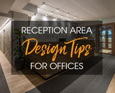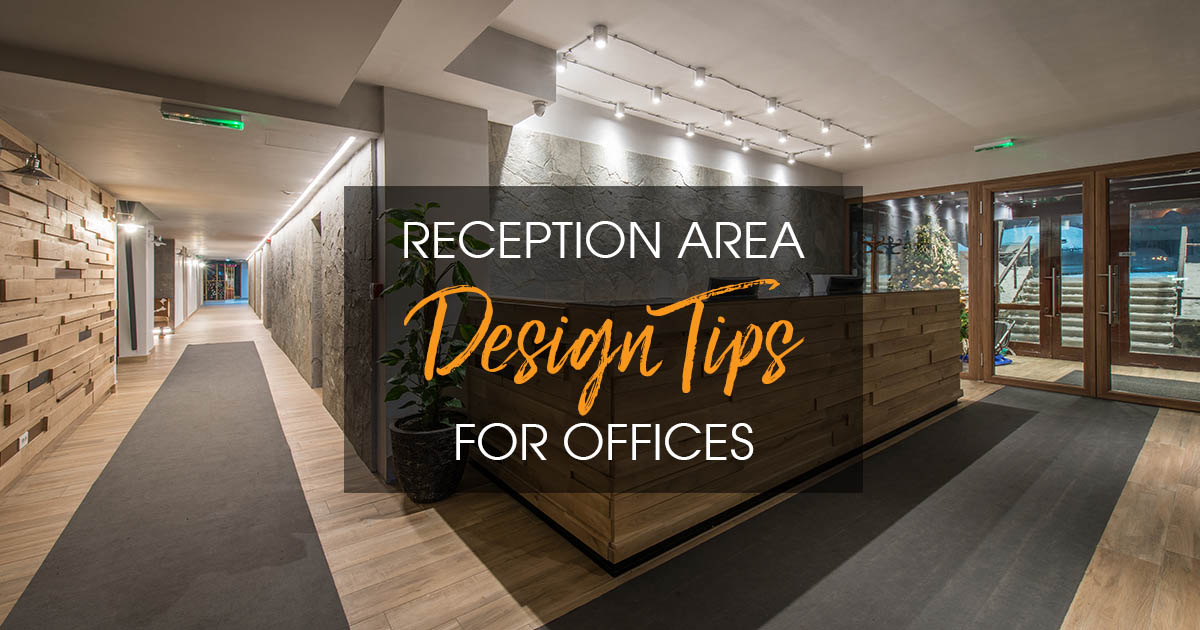
The reception area is the first thing employees, clients, and potential prospects see when they walk into an office.
We’ve all heard the expression “first impressions count,” and it certainly applies to office spaces.
As a designer, you want to make sure you present your client with a reception area design that will cater to their needs as well as their brand.
Your goal is to create an elegant, beautiful and comfortable space that accurately embodies the tone of the company.
Here are 6 reception area design ideas for offices that will help you design a welcoming space for your client.
Subscribe to 2020 Blog
Elegant reception area design
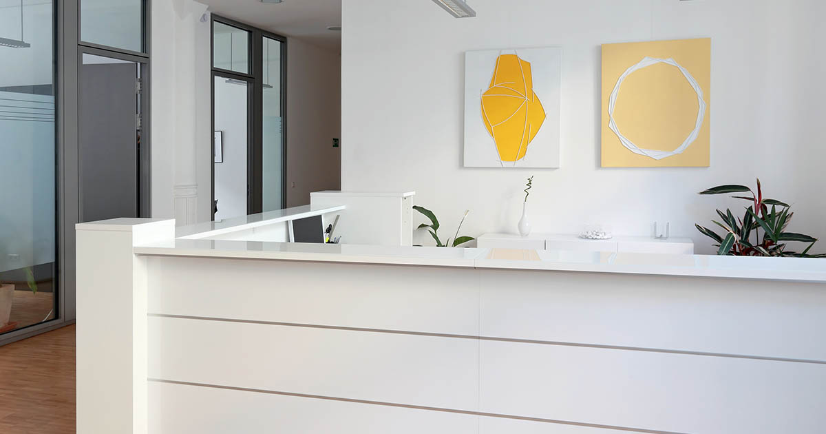
Whether you’re designing for a small start-up company or a big law firm, you want the reception area to feel elegant and clean.
Elegant doesn’t necessarily mean overly fancy or extravagant – it means the space should be both stylish and pleasant.
There is a lot of traffic that passes through the reception area of an office. If you can offer a positive experience via your unique design to everyone who passes through, then you’ve succeeded.
An outdated or bland reception area design can have a negative impact on the mood of employees, clients, and other visitors. Avoid this by creating a warm and elegant environment.
Easy layout
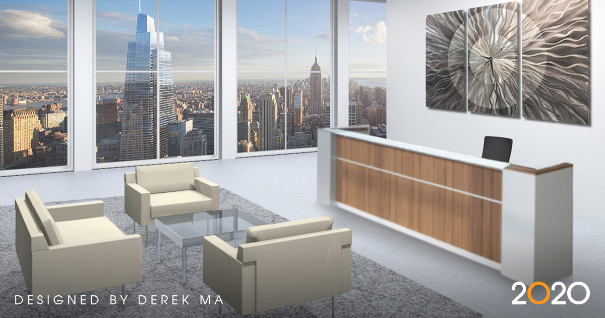
The layout of the reception area is especially important because it reflects on how the rest of the company is set up.
An easy layout that visitors won’t have trouble navigating is key.
Depending on how much space you have to work with, you can create a natural flow that will lead visitors from the elevator or door to the front desk and subsequently to the seating area without any obstacles in the way.
You can use professional office design software to help you design the perfect reception area layout for any company, small or large.
Comfortable seating
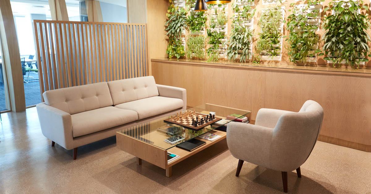
No reception area design is complete without comfortable seating.
Offices generally accommodate clients in the reception area, and offering them comfortable seating while they wait is an absolute must.
You’ll have to ensure there are enough seats available for the company’s needs, that they’re the right size and shape, and that they’re comfortable enough to make visitors feel relaxed.
Durable materials

Another thing to keep in mind when it comes to reception area design is the durability of the materials you choose.
As previously mentioned, the reception area of an office gets a lot of traffic throughout the day, which means there’s a lot of potential wear and tear.
Whether it be the seating material, front desk material, or flooring, it’s best to offer the client highly durable materials that will stand the test of time – and heavy usage.
Appropriate color scheme & branding
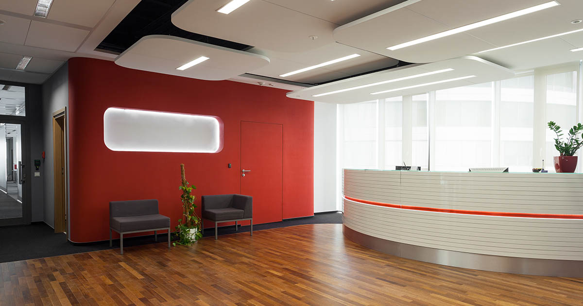
Depending on the company you’re designing for, you’ll have to use a color scheme that flows harmoniously with their branding.
Normally, soothing or neutral colors are used in a reception area with the company logo clearly visible. The soothing colors help with creating a relaxed environment in an otherwise chaotic area.
You can also use the company’s colors if they’re not too domineering, unless that is the effect the client wants you to go for.
The walls, couches/seating, front desk, and floor color need to work well together to create a beautiful space where visitors can feel welcome without being overwhelmed.
Want to explore more?
[Free eBook] Are You Impressing Your Clients With Breathtaking Renderings?
This ebook is an interactive, informative and inspirational collection of designs to inspire your creativity and help you close more sales in the process.
Related Posts
Share this Post

